Categories
Money money money...
Could we help you? Please click the banners. We are young and desperately need the money
Last updated: June 24th 2025
Categories: Common Web Development, CSS, IT Development
Author: Tim Fürer
CSS: Frosted Glass Effect / How to Blur behind Element
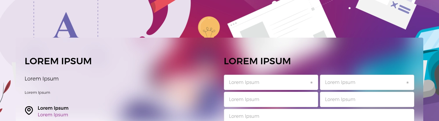
The frosted glass effect, which became really popular in the early 2020s, is often associated with the modern design of Apple's user interface (UI). Frosted glass elements obscure what lies behind them using a slightly transparent, white blurring layer. When overlaid on busy, colourful backgrounds, such as pictures, this creates soft and naturally attractive colour gradients.
To achieve the effect in CSS, we'll be using the backdrop-filter property, which, as of writing this article, recently achieved Baseline compatibility in September 2024. According to caniuse.com, this means that over 91% of common browsers in use support this feature.
How to frost that glass
For preparation, I'd recommend setting up a basic HTML environment with some colourful picture as the background. Next, create some child element that overlays the background that we can apply the frosted glass effect to.
Now for the necessary styles. I find that the following values provide a satisfying balance to the effect. Of course, you're encouraged to tweak them to your liking:
background: rgb(255 255 255 / 50%);
backdrop-filter: blur(32px);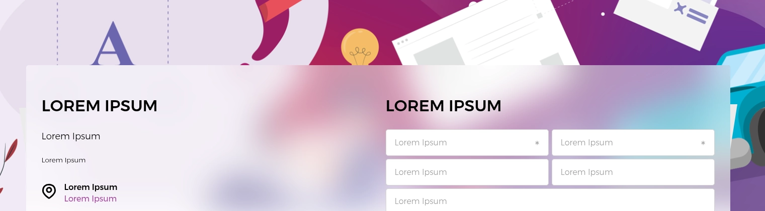
You can also completely ditch mixing in the white for a purer, less milky effect (although this comes with some major readability disadvantages):
background: none;
backdrop-filter: blur(32px);